Lab 11
24 November, 2023 - Comprehensions & Visualization
- PyCharm recap
- Overview of This Lab
- Exercise 1: Filter, Map & List Comprehensions (standard)
- Exercise 2: Other Comprehensions (challenge, hard)
- Plotting With Matplotlib
- Exercise 3: Line Plots (standard)
- Exercise 4: Scatter Plots (standard)
- Exercise 5: Bar Plots (standard)
- Exercise 6: Show an Image (standard)
Welcome to week 12, lab 11!
PyCharm recap
This week we continue using PyCharm and running code in the terminal. In lab 7 you can find information about: installing anaconda, opening projects, configuring unittests, reading unittests results, and debugging.
Overview of This Lab
This week we have fourteen different exercises that range in difficulty:
- Exercise 1: Filter, Map & List Comprehensions (standard)
- Exercise 1a: Filter (standard)
- Exercise 1b: Map (standard)
- Exercise 1c: Combining filters & maps (challenge, medium)
- Exercise 2: Other Comprehensions (challenge, hard)
- Exercise 3: Line plots (standard)
- Exercise 3a: Sine & Cosine Plot (standard)
- Exercise 3b: Sine & Cosine Extended Plot (challenge, hard)
- Exercise 3c: Programming Languages Through Time (challenge, hard)
- Exercise 4: Scatter Plots (standard)
- Exercise 4a: Random 2D noise (standard)
- Exercise 4b: Iris Flower (challenge, hard)
- Exercise 4c: Iris Flower Subplots (challenge, very hard)
- Exercise 5: Bar Plots (standard)
- Exercise 5a: Programming Language Percentage (standard)
- Exercise 5b: Programming Language Percentage Extended (challenge, very hard)
- Exercise 6: Show an Image (standard)
- Exercise 6a: MNIST (standard)
- Exercise 6b: MNIST Subplots (challenge, hard)
All students, regardless of experience, should be able to complete the six standard exercises. Whether you complete all six is up to you.
The eight exercises marked as “challenge” provide additional practice for interested students. We believe that any student in this class who completes the standard exercises should be able to complete the “medium” difficulty challenge.
For more advanced students, you might find the more difficult Iris Flower Subplots or Other Comprehensions exercises to be more interesting. Feel free to skip the standard exercises if you think they are insufficiently challenging. You can also look at previous labs for challenging exercises.
If you feel that this week’s challenges are too hard for you, feel free to do a challenging exercise from last week which should be easier now that you know more.
Exercise 1: Filter, Map & List Comprehensions (standard)
Before, we explain what filters, maps, and list comprehensions are it is important to understand why we use them. The functionality of all three can be achieved by initializing a new list and while looping the original list adding elements to it. This would look something like:
new_lst = []
for v in orginal_lst:
    # do something
    new_lst.append(v)
However, the downside of this approach is that it is not clear what the code does especially if there are multiple if statements in the for loop that alter what is added to the new_lst. Also, it might not be clear at a first cleanse what you code should do at all. Therefore, we like to use code blocks or coding concepts that clearly signal what the intent of the code is. For example, a filter can only discard items from an iterable not changes them or add new.
List comprehensions
List comprehensions are a general way to signal that you want to create a new list based on another list. You can also see them as shorthand for code we wrote above whereby writing the for loop in the square brackets we get the same behavior as creating a new list and appending the items to it. Below, you will see visualization of this idea.

Before, we go in to detail how to construct a list comprehension that does more than create the same list, let’s go over what filter and map do and how they are connected to a list comprehension. This will also answer the question: how to use list comprehensions.
Exercise 1a: Filter (standard)
The concept of a filter is a bit self-explanatory, it filters which items from an iterable are kept and which are discarded. Filters keep items based on a function applied to the item, if it returns True the item is kept otherwise it is discarded. This means that filter need two inputs: a function and an iterable. They return an iterator that return the filtered object one by one.
Filters are connected to list comprehensions because you can also filter lists with list comprehensions. When you want to use a list comprehension as a filter, you can use an if statement after the for loop part. This can be visualized like this:

Thus, the following code is a list comprehension that works as a filter.
filtered_lst = [v for v in original_lst if ...]
This is comparable with the following code:
filtered_lst = []
for v in original_lst:
    if ...:
        filtered_lst.append(v)
Now, open filter.py and follow the instructions. In this exercise, we will start implementing a filter behavior using for loops and a new lists. Each successive function has the same behavior but asks you to code it a bit different to work slowly towards using the filter function.
Exercise 1b: Map (standard)
The concept of a map is less self-explanatory but in the context of the course foundations of computer science a map is similar to a function, where it maps one set of value/objects to another. In other words, map takes each item in a list and applies a function to that object which creates a new list of equal length. Therefore, map needs the same inputs as filter: a function and a iterable. The only difference is how the function is used.
Maps are also connected to list comprehensions because you can also use list comprehensions to get the functionality of map. When you want to use a list comprehension as a map, you can apply any function to part before the for loop, e.g., [v**2 for .... Below, you can find a visualization:

Thus, a mapping can be achieved with the following code:
mapped_lst = [func(v) for v in original_lst]
This is comparable with the following code:
mapped_lst = []
for v in original_lst:
    mapped_lst.append(func(v))
Before, we continue with practicing, let’s examine a common confusion/mistake when turning normal for loops into list comprehensions. The problem arises when if statements are not used as filters but as maps. This happens when you have an if else statement that both append to the list. See below for an example:
new_lst = []
for v in original_lst:
    if ...:
        new_lst.append(func1(v))
    else:
        new_lst.append((func2(v))
When turning such a for loop into a list comprehension it is better to use substitution and think about map functions and filter functions. In the example above the if else statement can be substituted with an new function. Thus:
def new_func(v):
    if ...:
        return func1(v)
    return func2(v)

new_lst = []
for v in original_lst:
    new_lst.append(new_func(v))
Alternatively, it can be written as a Ternary statement, see lab 7 Ternary Operator.
new_lst = []
for v in original_lst:
    new_value = func1(v) if ... else func2(v)  # These two lines of code can be combined into one.
    new_lst.append(new_value)
This would result in the following list comprehension:
new_lst = [func1(v) if ... else func2(v) for v in original_lst]
Now, open map.py and follow the instructions. In this exercise, we will start implementing a map behavior using a for loops and a new lists. Each successive function has the same behavior but asks you to code it a bit different to work slowly towards using the map function.
Exercise 1c: Combining filters & maps (challenge, medium)
Now, that we have seen both filters and maps, we can also combine them in a list comprehension. There, is no equivalent python function to do this but you could chain filter and map as follows map(func1, filter(func2, lst)). Here, we first filter and then map which is more efficient but the other way around would also work. An example of a list comprehension that is a filter and map at the same time would be:
altered_lst = [func(v) for v in original if ...]
This is equivalent to the following code:
altered = []
for v in original:
    if ...:
        altered.append(func(v))
Again, a visualization can be made where each part in the for loop goes in the list comprehension:

if statements can be even more confusing when combining maps and filters into a list comprehension. Let’s examine the example below:
new_lst = []
for v in original_lst:
    if condition1:
        continue

    if condition2:
        new_lst.append(func(v))
    else:
        new_lst.append(v)
Again, here the if else statement can better be written as a ternary statement or a separate function, in other words a mapping, while the if continue statement must be seen as a reverse filter. This leads to the following list comprehension:

Now, open combine_map_and_filter.py and follow the instructions. In this exercise, we will start implementing a map and filter behavior using a for loops and a new lists. Each successive function has the same behavior but asks you to code it a bit different to work slowly towards using the combination of filter and map function.
Exercise 2: Other Comprehensions (challenge, hard)
List comprehensions are probably the most used comprehension, however, in this exercise, we will look at other comprehensions. There are three other types of comprehensions: sets, dictionaries, generators. There are no tuple nor string comprehensions because of their immutable nature. Later, we will discuss how to use effectively make them.
Set Comprehensions
Set comprehensions are maybe the most similar to list comprehension, where the only difference is that a set comprehension generates a set and has therefore unique items. Similar as creating a new set (with items) a set comprehension can be recognized and created with curly brackets {...}. Important note, an empty set can not be created with curly brackets {} as that syntax is already reserved for empty dictionaries. However, similar to other datastructures such as lists and dictionaries it can be created using set() with no argument. Below, you can find an example of a set comprehension.
new_set = {v for v in iterable}
Set comprehensions work similar to list comprehensions in th way that they also have a filter and map option:

Dictionary Comprehensions
Similar to set comprehensions, dictionary comprehensions are created using curly brackets {}. The difference is that a dictionary comprehension needs a key value pair, similar to creating a dictionary like {"A": 1, "B" : 2}. Below, you can find an example of a dictionary comprehension. Note, that for simplicity we used key value pairs that are the same, but in “real” code you either walk over two iterables with for example zip or you apply a function to value or key.
new_dict = {v: v for v in iterable}
Unsurprisingly, dictionary comprehensions also have a filter and map function, however, because we need a key and value, there are actually two map functions: one for the key and one for the value. Below, an example where we loop over two iterables, one for the keys and one for the values.

Generator Comprehensions
The most versatile comprehensions of all is the generator comprehension. It can also be seen as the “mother” of all comprehensions that do and do not exist. First, lets have a look at how to construct one and how they work. A generator comprehensions is created similar to a list comprehension but with round brackets (). For example:
new_generator = (v for v in iterable)
Ofcourse a generator comprehension has also a map and filter functionality. Fun side note, filter and map are generators. Thus, the following code are identical:
new_generator1 = map(map_func, filter(filter_func, iterable))
new_generator2 = (map_func(v) for v in iterable if filter_func(v))
list(new_generator1) == list(new_generator2)  # This is true, list is needed as generators can not be compared.
While, a generator comprehension looks similar to the other comprehensions there is one major difference, generators are not a data structure, but more a function as we have seen before when making them. Their use is therefore similar to other generators, which makes them good for use in for loops or to create datastructures. For example, the generator range is often used for this purpose. This means that we can create a list, dictionary, set, string, tuple, etc. by just using a generator comprehension and convert it to specified type. Note, less general code is better, so if you want a list and you can use a list comprehension use that and not a generator comprehension. Below, you can find some example on how a generator comprehension can be used. Note, that the round brackets can be removed if used directly in a function.
new_lst    = list(v for v in iterable)
new_tuple  = tuple(v for v in iterable)
new_string = ''.join(v for v in iterable)  # iterable must contain strings
new_set    = set(v for v in iterable)
new_dict   = dict((v,v) for v in iterable) # This creates a dict equal to {v: v for v in iterable}

# Ofcourse this does not make any sense, unless you also apply a filter or map.
for item in (v for v in iterable):
    ...

# Do not use this unless necessary, but the point is you can EFFICIENTLY make anything using a generator comprehension.
new_array  = np.fromiter((v for v in iterable), float)  # You must know the type
Now, open other_comprehensions.py and follow the instructions.
Plotting With Matplotlib
Let’s go through some functionality of matplotlib before starting the plotting exercise. There are many plotting functions and input arguments that can be used with matplotlib and often google is your best friend if you want something specific. Here, we will go briefly through everything you need for the standard exercises. First, we will go through some basic plotting functions and how to make subplots. Second, we will go through some common input arguments. Third, we will explain some other basic matplotlib functionality related to your plot configurations. Fourth, we discuss some extra functions you will need for the exercise which are: loading and saving numpy array and combining f-strings and raw-strings.
IMPORTANT NOTE, while matplotlib is the most common plotting library for python and probably also the most documented, it is notoriously weird to use. There are many ways to achieve the same result and there are many many arguments that work is mysterious ways. So, if you want to make something complex there is always a way to do it and probably someone asked it on stackoverflow, but it might not be logical or simple to code. However, the exercise in this lab should be straight forward. As a final note, the explanations provided below explain the general behavior of the functions, however, there may be many exceptions where the functions work just a little bit different.
In general, we mostly use the module pyplot of package matplotlib. This is commonly important as follows:
import matplotlib.pyplot as plt
Therefore, in the following text we will rever to the module as plt.
Plotting Functions
There are many plotting function that generate graphs, but the following four categories are a good basis, additionally two basic configuration tools are discussed:
- Line graphs/plots, these plots can be made with
plt.plotfor a line (documentation) orplt.fill_betweenfor coloring the area between two lines (documentation).plt.plotneeds y-values and optionally x-values.plt.fill_betweenneeds two set of y-values of equal length and optionally x-values. - Bar graphs can be made in two flavours with
plt.barfor vertical bar plots (documentation) andplt.barhfor horizontal bar plots (documentation). Bar plots needs two inputs the position/name of each bar and the height/value of each bar. - Scatter graphs can be made with
plt.scatterand need both x and y-values (documentation). - Image can be shown with
plt.imshowwhich needs a 2D array of x,y values or a 3D array with x,y and color values, where a color can consists of a 3D (R, G, B) or 4D (R, G, B, alpha) vector (documentation). - To make a plot a certain size or have a certain dpi (sort of resolution) you can use
plt.figure(figsize=(width, height), dpi=100)(documentation). Though, generally you do not need this unless you need the output which is figure. - When you want multiple plots/graphs in one figure (screen), you can use
plt.subplots(documentation). It takes at least two inputs number of rows and number of columns. However, the important part is the return which isfig,axs.figis similar to the output ofplt.figure, butaxsis new.axscontains a 2D or 1D array, see documentation, which contains the axes of each plot but simply put it contains the figures. Now, if you want to plot a line plot on the left upper plot (plot 0), you need the following codeaxs[0,0].plot(). Thus, instead of usingpltwe use the axes that we want. For a lot of features, that we will discuss later, the name of the functions changes as well by addingset_in front of the name. For example,plt.xlim()becomesaxs[0,0].set_xlim().
Plotting Arguments
Many of the above graphs support additional arguments. Here, we will discuss the most used ones:
coloris an argument that can often be used to change the color of a graph. This is either a 3D or 4D vector/array, containing the colors red, green, blue and optionally alpha. However, many times it is easier to just provide a name or letter. For example,color="r"is the code for the color red. There are many predefined colors which can be found here. Hint: A weird color name is the letter for black namelyk. Lastly, it is sometimes possible to plot multiple graphs with one function call. For example,plt.plot(x, Y), whereYis a 2D array, plots multiple line graphs where each line consists ofY.shape[0]points and there areY.shape[1]lines. In this case, color can be a 2D array (number of lines x color) to give each line a separate color.cmapmeans color map and is similar to color but instead of giving something a single color, the color depends on a value which can change. Eachpltfunction that plots something has eithercolororcmapas argument. An example of whencmapis used is withimshowwhen you want a heat map. You can make your own heatmap, but it is easier to use one of the many predefined heatmaps which can be found here.alphacan be used to give somthing an alpha value, i.e., an opacity value.alphacan be used in combination withcoloror on its own.labelis a very useful tool if you want to make an automated legend. It can be added as an argument to most functions that make a graph. This gives a name to the graph. Note, that raw string can be used to use (la)tex format, later more on that. Similar to color, when multiple graphs are created at ones it can also be a list of strings where each string corresponds to a single graph.
Plotting Features
Making the graph is usually only have the work. For scientific papers, plots need axes labels, correct ticks, a legend, and potentially more. Here, we will show some helpful functions to achieve that:
plt.legendcreates a legend in your plot (documentation). This is automatically done when using labels. However, you can also manually add the labels and graphs that need to be displayed. Furthermore, thelocargument lets you place the legend at a preferred location. The defaults value forlocisbestwhich places the legend at the best place, i.e., most empty.plt.gridcan be used to display the mayor or minor axes for both the x and y axes (documentation). The default is displaying both mayor axes.plt.xlim(documentation),plt.ylim(documentation) are useful to choose what part of the axes need to be displayed in the plot. If you not use these function the axes for the plot contain all data plus a little bit more space. The input can be one argument (minimum) or two arguments (minimum and maximum).plt.xticks(documentation),plt.yticks(documentation) can be used to change the ticks. Ticks are responsible for displaying values beneath or to the left of an axis. You can set either the mayor or minor ticks. The input is at least the argumenttickswhich sets the location of the ticks. If you want to change the value for the ticks you can uselabels. For example, you can set ticks for each pi value withplt.ticks(np.linspace(0, 2*np.pi, 3)), however, now they are still displayed as3.1416and not as the symbol pi. To do this you need thelabels, thus:plt.ticks(ticks = np.linspace(0, 2*np.pi, 3), labels = ["0", r"$\pi$", r"$2\pi$"]). Here, raw string are used to display (la)tex code, more on that later.plt.axline(documentation),plt.axhline(documentation), andplt.axvline(documentation) can be used to create a straight line. This can be very helpful if you want to create the axes lines (instead of the whole grid) or want to make a visual aid line. For example, to display an asymptote.plt.axlinecan create any line, whileplt.axhlineandplt.axvlinecreate respectively a horizontal and vertical line.plt.xlabel(documentation),plt.ylabel(documentation) can be used to give an axis a name/label.
f-sting & raw strings
f-strings are very useful when creating strings that contains variable. When working with plt combining a list comprehension with f-strings can be a handy tool to created labels. For example, the following code create ticks labels round to two decimal [f"{v:.2f}" for v in np.linspace(0, 1, 10)].
Another tool you can use to create nice labels is raw strings. They enable you to use (la)tex code inside labels/strings. Note the parentheses around (la)tex, this is because technically you do not use latex but MathText which are both tex instances. However, they work 99.9% of the time the same. Raw strings can be made similar to f-strings by adding an r in front of the quotes. For example, r"$2\pi$" creates a label in your plot that looks like 2π.
Now, sometimes it would be great if we can combine raw string and f-strings. This is possible but a bit clunky. To create a combination you can just add rf in front of a string like this rf"". However, it can get a bit confusing because tex and f-string both use curly brackets. Therefore, here a guide how to work with curly brackets when working with rf-strings:
- One curly bracket is for the f-string. For example,
rf"${count}\pi$"place the variablecountin front of the symbol π. - Two curly brackets between dollar signs are for (la)tex input. For example,
rf"$\frac{{1}}{{2}}$"creates the nicely formatted fraction 1/2. - Three curly brackets between dollar signs are for python variables inside (la)tex input. For example,
[rf"$\frac{{1}}{{{n}}}$" for n in range(2,10)]creates a list with all the fraction nicely formatted from 1/2 to 1/9.
Loading & Saving Data Using Numpy
To make the exercises a bit more fun than displaying random values, we downloaded and cleaned some data from the web. This data consists of numpy arrays and to make it more accessible and easy to work with we also stored it as numpy arrays. The code will be given in the exercises but for the curious minds here is a quick explanation how it works.
You can save any numpy array with the following code:
np.save(filepath, data) # where filepath is a string and data a numpy array.
This can then be loaded with the following code:
data = np.load(filepath) # where filepath is a string and data a numpy array.
Exercise 3: Line Plots (standard)
In this exercise, you will practise with plotting lines and several things related to plotting lines, such as, labeling data, coloring space between lines and changing axis labels. All the functions to do this are explained in the general section about matplotlib, see Plotting With Matplotlib.
Exercise 3a: Sine & Cosine Plot (standard)
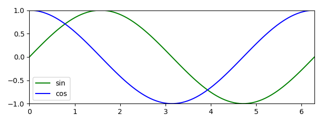
Try to recreate the plot below. Here, the cosine and sine function are plotted between 0 and 2pi. Make sure each line has its own label and a legend is shown. Also, show only the relevant part of the plot. Thus, for the x-axis show the value between 0 and 2pi and for the y-axis show the values between -1 and 1.
Now, open sine_cosine.py and follow the instructions.
Exercise 3b: Sine & Cosine Extended Plot (challenge, hard)
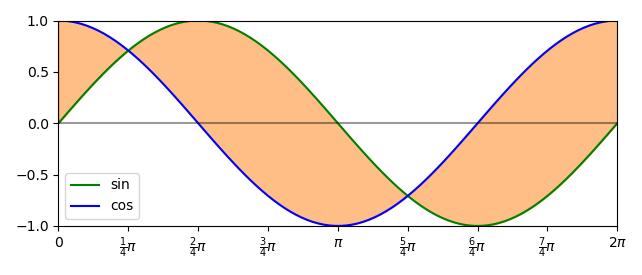
Try to recreate the plot below. Here, we will add a colored surface between the sine and cosine function, which is colored orange. Also, we set the x-axis labels to fractions of pi and finally create a visible x-axis.
Now, continue working on sine_cosine.py and follow the instructions.
Exercise 3c: Programming Languages Through Time (challenge, hard)
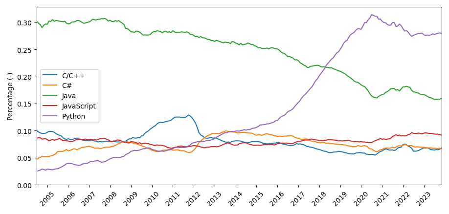
Try to recreate the plot below. Here, we will make a plot containing the percentages for the five most used programming languages throughout the last two decades. In this exercise, we will work with real data which can be found at pypl. The data can also be loaded from programming_time_data.npy located in the data folder.
For this plot, we will continue creating our own x-axis labels which are also rotated 45 degrees to make them more readable. Similar to the previous plots, make sure that the lines stop and start at the border of the images and that the y values start at zero. Also, give the y-axis a label as well as each line a label and color. Lastly, you can try to plot all lines using one plt.plot function. This can be done by giving a matrix (2D array) as input instead of a vector (1D array).
Now, open programming_history.py and follow the instructions.
Exercise 4: Scatter Plots (standard)
In this exercise, you will practise using scatter plots. All the functions to be able to do this are explained in the general section about matplotlib, see Plotting With Matplotlib.
Exercise 4a: Random 2D noise (standard)
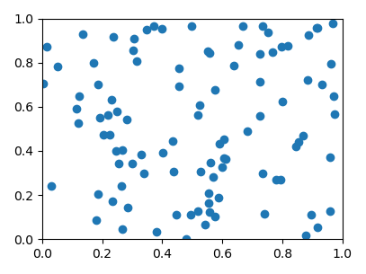
Try to recreate the plot below. In this plot, you will visualize 2D random noise using a scatter plot. In the code the x,y values are already given. However, it is good to know that np.random.random() will become deprecated code and new code should use rng = np.random.default_rng(seed=42) followed by rng.random().
For this plot, you only need to make sure that you set the limits for the x and y axis correctly. Now, open random_noise.py and follow the instructions.
Exercise 4b: Iris Flower (challenge, hard)
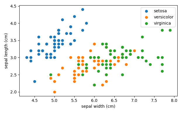
Try to recreate the plot below. In this exercise, we will use the iris (flower) dataset. This dataset contains data about 150 iris flowers from three different subtypes: Setosa, Versicolor, Verginica. Therefore, we need three scatter plots in one figure to plot the data of each subtype. Give each scatter plot its own label and color. The data is loaded into a new object of class SklearnData to make working with it easier. As a side note, this data is commonly used when learning about various machine learning algorithms.
For this exercise, you will need the following attributes form iris:
- data: This contains four measurements/features from each flower petals.
- target: This contains a value to which subgroup the data belongs (0,1 or 2).
- target_names: This contains the names of each subgroup.
- feature_names: This contains the names of the four measurements (needs to be used for the axes labels).
You can choose which features to plot. Don’t forget to add a legend and axes labels. Now, open iris_dataset.py and follow the instructions.
Exercise 4c: Iris Flower Subplots (challenge, hard)
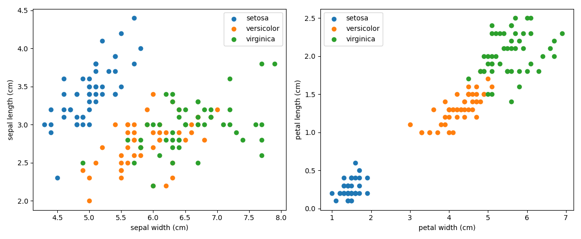
Try to recreate the plot below. Here, we will extend the previous exercise by making a subplot. This enables us to show all four features at the same time in two plots. Don’t forget to give all axes a label and both plots need a legend.
Now, continue working on iris_dataset.py and follow the instructions.
Exercise 5: Bar Plots (standard)
In this exercise, you will practise using bar plots. All the functions to be able to do this are explained in the general section about matplotlib, see Plotting With Matplotlib. Exercise 5, only contains an exercise of making a horizontal bar plot. However, lab 9 Exercise 3c: Displaying dictionaries with counts is an exercise where you can practise making a vertical bar plot.
Exercise 5a: Programming Language Percentage (standard)
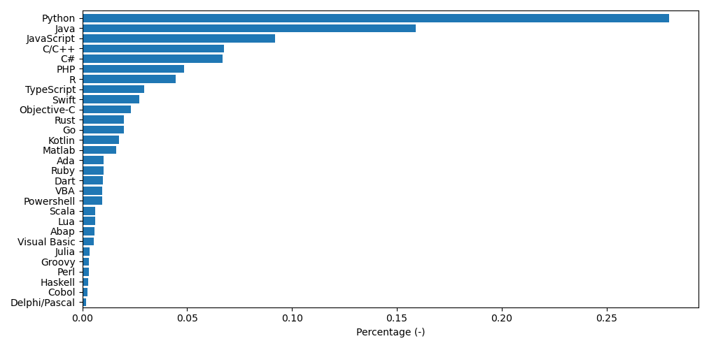
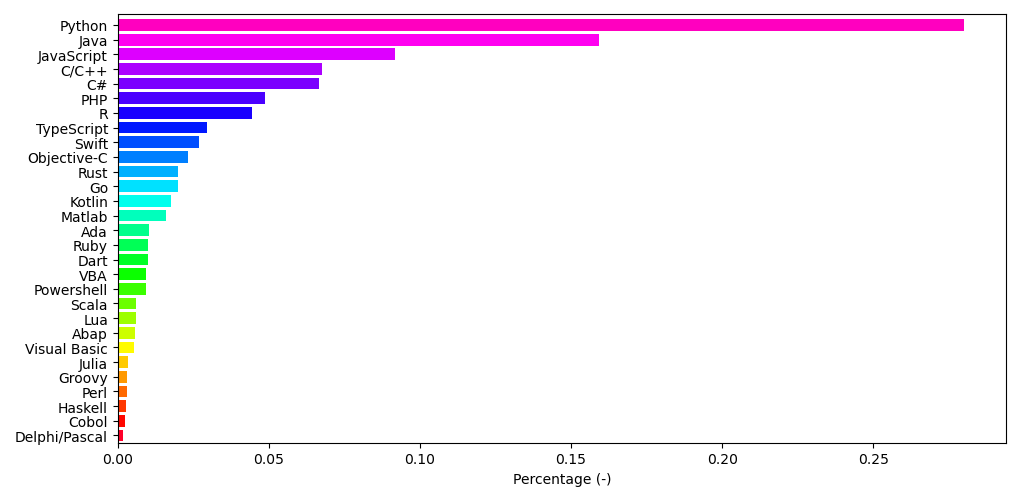
Try to recreate the plot below. In this plot, you will visualize how much each programming language is currently used according to PYPL. In this exercise, we will work again with real data which can be found at pypl. The data can also be loaded from programming_now_data.npy and programming_now_language.npy located in the data folder.
While making the plot make sure that the data is sorted and don’t forget to add a x-axis label. Now, open random_noise.py and follow the instructions.
Exercise 5b: Programming Language Percentage Extended (challenge, very hard)
Try to recreate the plot below. Here, we will extend the previous exercise by colouring the previous plot. This can be done by adding enough colors to the color argument or to automatically create the colors using plt.get_cmap("cmap_color"). When using get_cmap a callable object is returned. This object, given input values between 0 and 1, can create colors on the color map (cmap). The plot below is just one possibility what you could do with such a cmap approach.
Now, continue working on iris_dataset.py and follow the instructions.
Exercise 6: Show an Image (standard)
In this exercise, you will practise showing images. All the functions to be able to do this are explained in the general section about matplotlib, see Plotting With Matplotlib.
Exercise 6a: MNIST (standard)
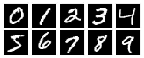
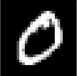
MNIST is one of the most popular datasets used in computer vision and consists of 60000 images, the dataset can be found at source. Each image is a handwritten number between 0 and 9. We have given in “MNIST_examples.npy” an example for each handwritten number. The saved array in “MNIST_examples.npy” is of shape (10,28,28), thus (image_number, x, y). Notice, that they are not colored as each x,y position only contains one value. In this exercise, you will show one gray image containing a handwritten number. An example of such an image can be found below. Don’t forget to remove all ticks from the image.
Now, open MNIST.py and follow the instructions.
Exercise 6b: MNIST Subplots (challenge, hard)
Try to recreate the plot below. Here, we will extend the previous exercise by making a subplot. This enables us to show all ten images at the same time. Don’t forget to remove all ticks.
Now, continue working on MNIST.py and follow the instructions.